Immobilien Sarbach
Agency: Sarbach Immobile, Switzerland
My role: Art Direction
Sarbach Group

Invest Beyond Borders
2017
Sarbach goes beyond simply selling property. We integrate you into the fabric of a world-class lifestyle. By managing the complexities, we enable you to fully embrace quality living. Our focus is on three distinct audiences: the international relocator, the business investor, and the second-home seeker.
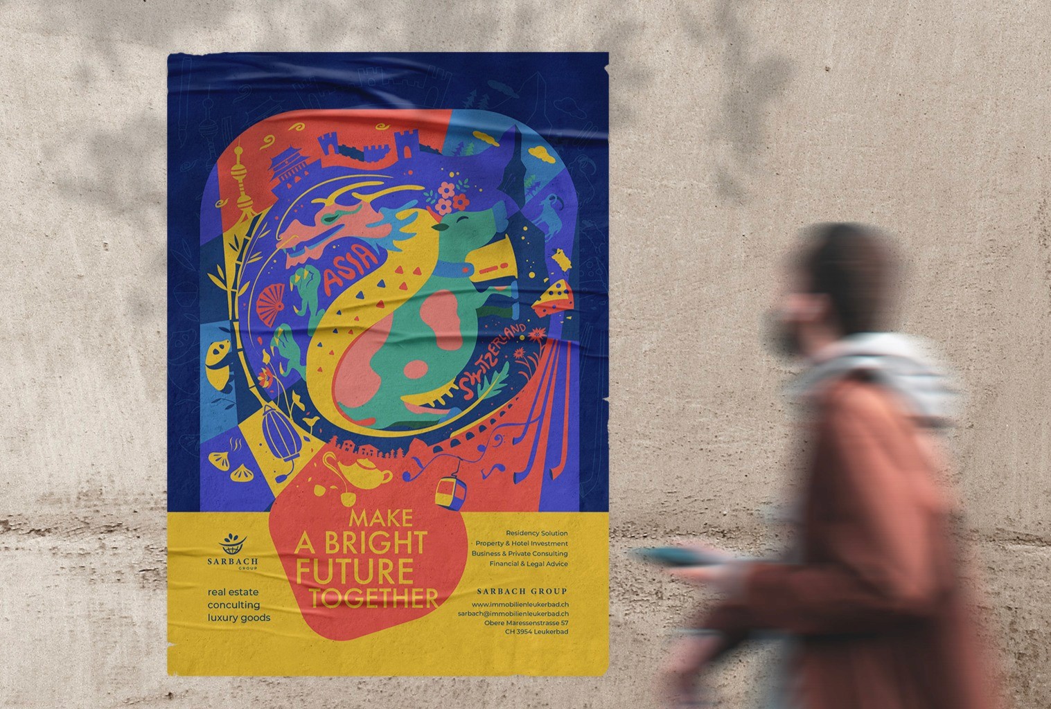
To expand Sarbach’s global reach and distinguish the brand from conventional real estate marketing, a culturally resonant approach was essential. Located in the heart of Leukerbad, Switzerland’s renowned thermal spa destination, Sarbach is uniquely positioned within a tourism-driven environment. Recognizing this, the founder identified Chinese visitors as a key initial audience and aimed to reflect a sense of connection and mutual appreciation between Switzerland, represented by Sarbach Group, and Asian clients.
The visual identity expresses this cross-cultural dialogue through a symbolic hero image. Two auspicious animals, a Chinese dragon and a Swiss cow, are positioned side by side. Their composition echoes the balance of yin and yang, representing harmony, interconnection, and mutual respect. The illustration draws from both cultural traditions, while the vibrant color palette evokes a celebratory, festival-like atmosphere that reinforces warmth, welcome, and shared prosperity.
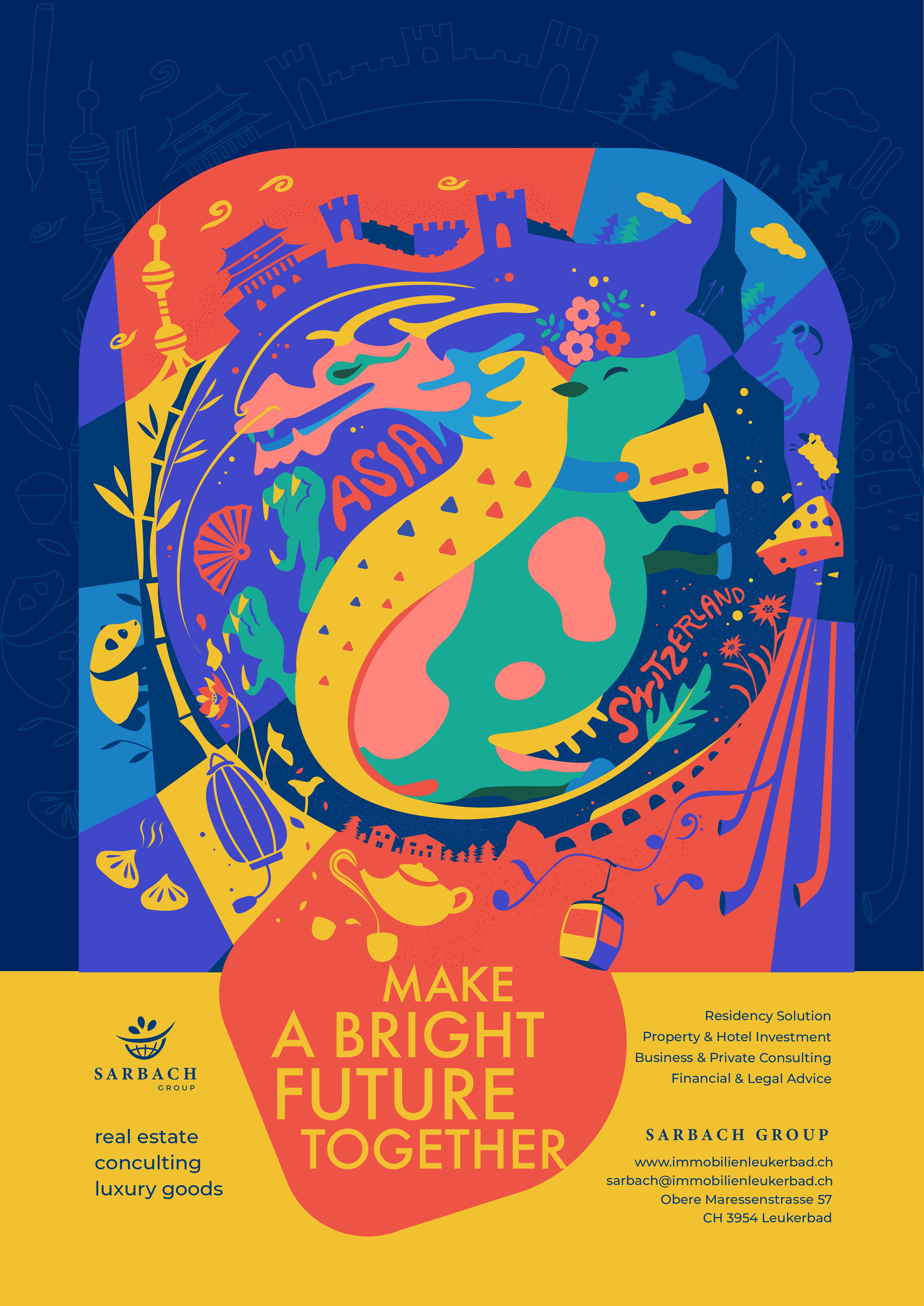
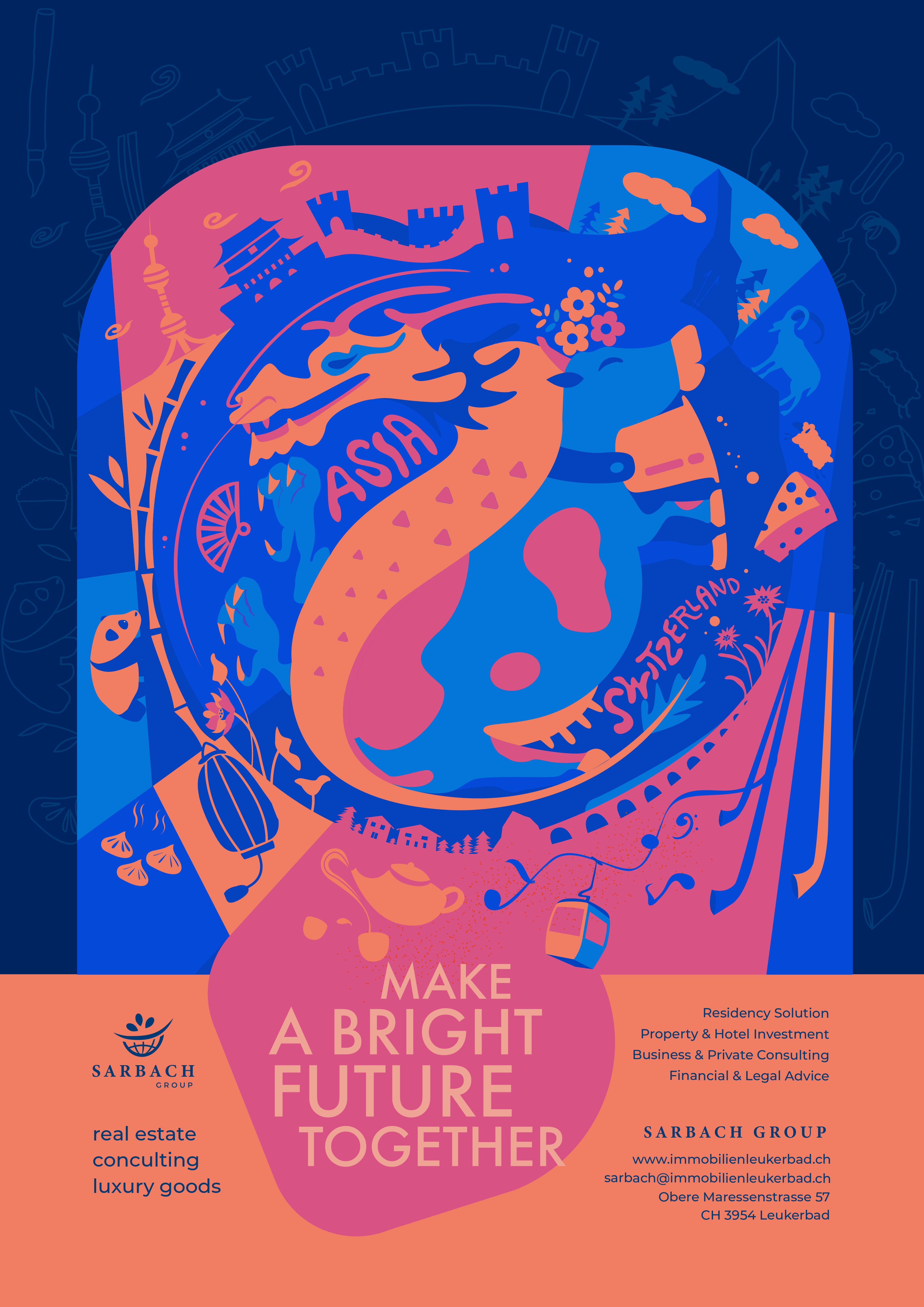
Swiss Your Trip.
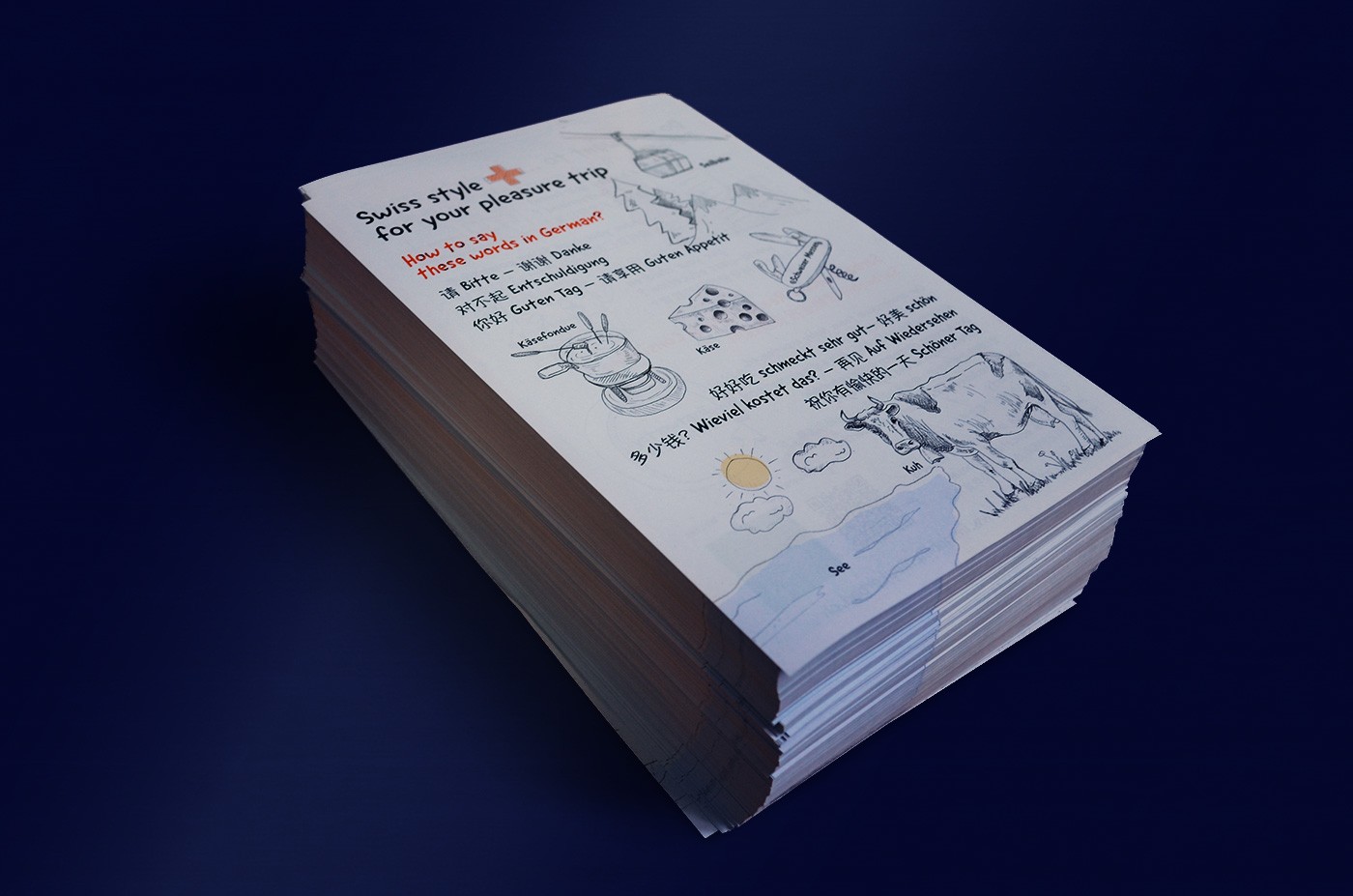
To further engage visitors in Leukerbad, flyers offer a direct and effective way to reach Chinese travelers, who are a key target audience. By including helpful tips written in simple, everyday language alongside cultural insights, the flyers provide accessible and relevant information. I believe this approach allows Sarbach to communicate locally in a more personal and friendly way.
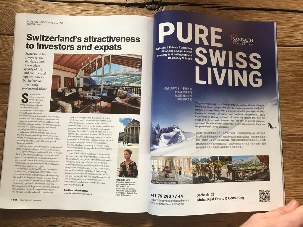
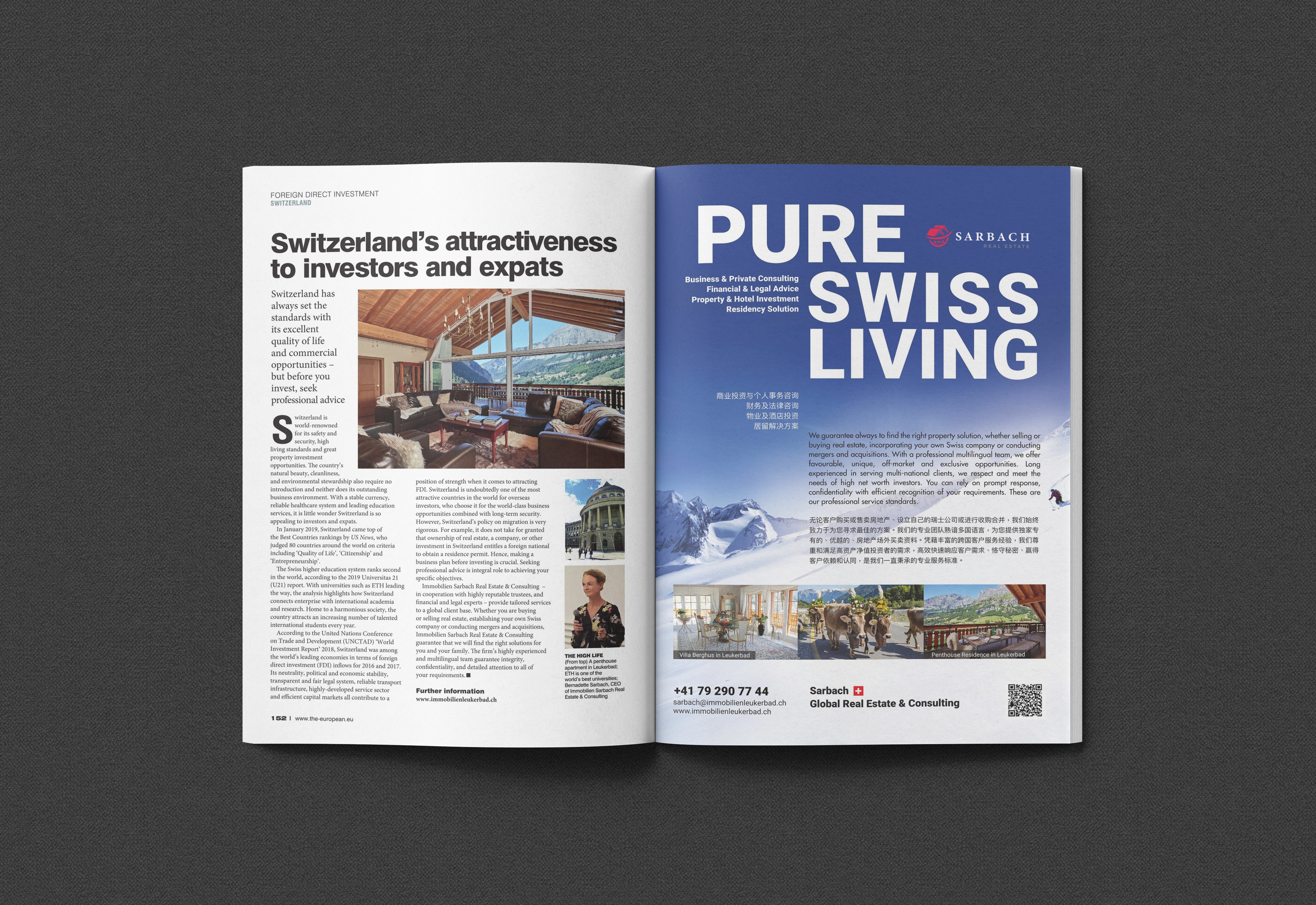
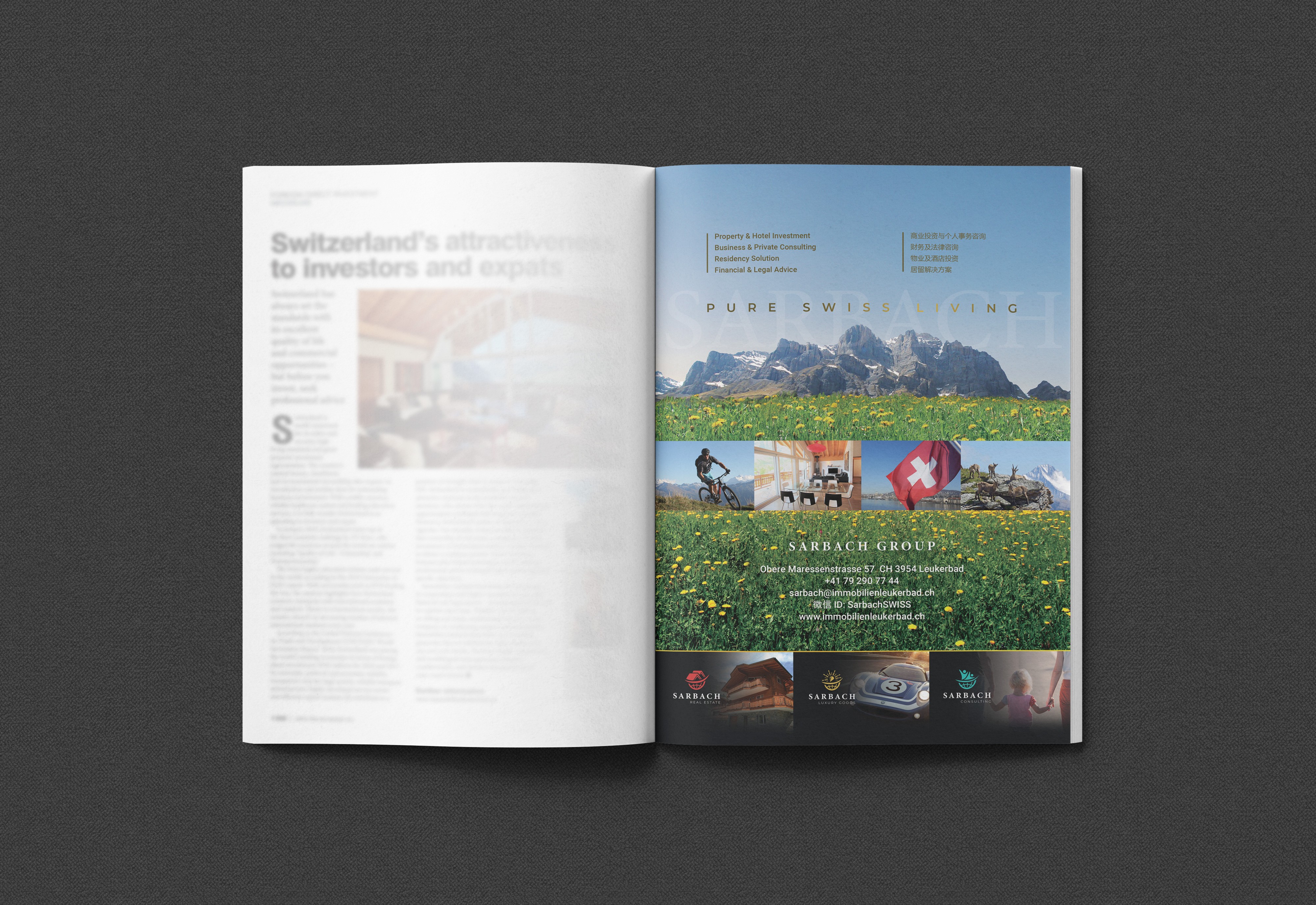
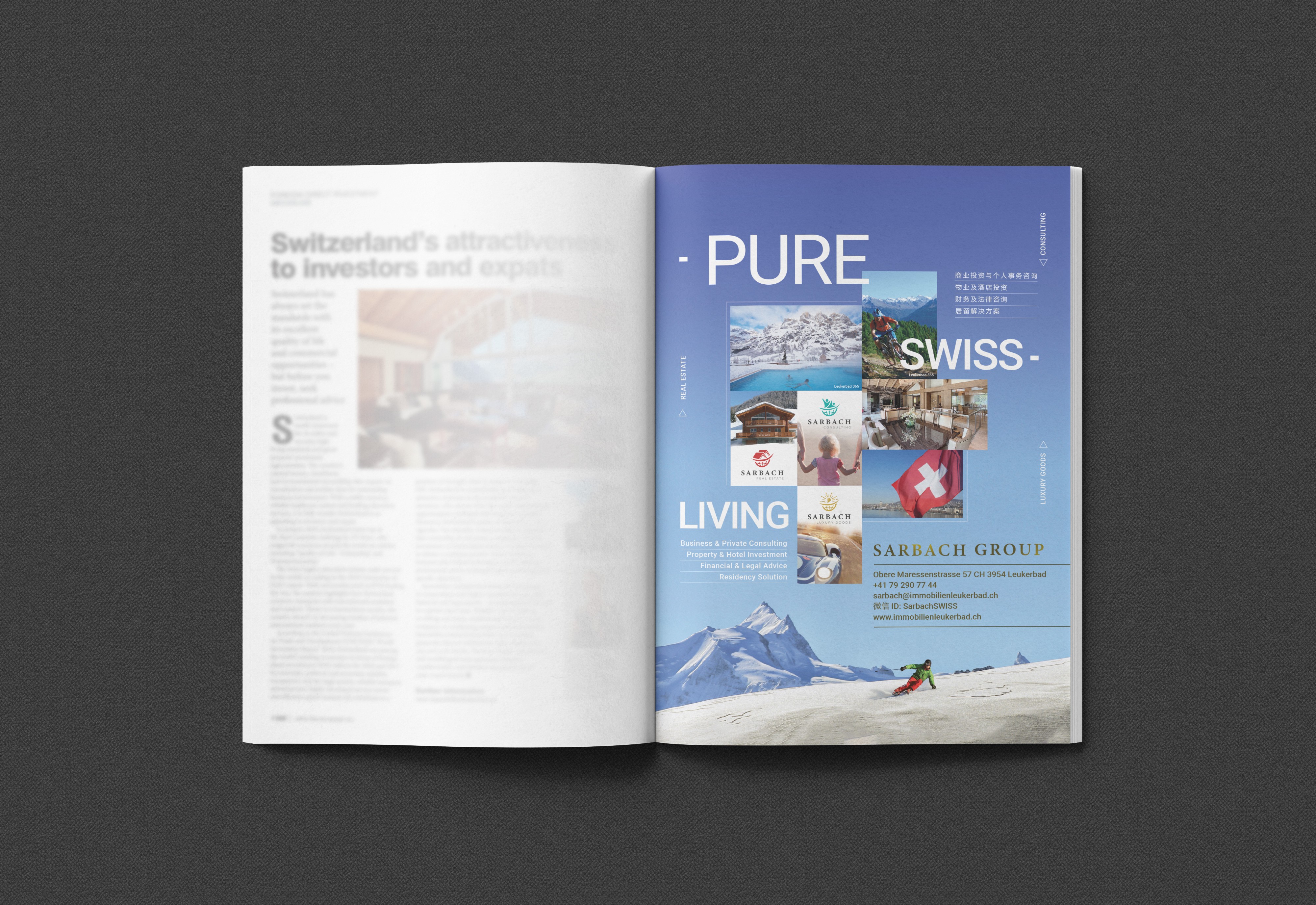
The European Magazine: Single Page Ad
2018-2019
For the European magazine, the target audience would be focused on wealthy seniors, who are often buying into a lifestyle for their next chapter. They are motivated by health, activity, beauty, and tranquility. Focusing on the landscape and accessible outdoor activities speaks directly to these desires.
In this context, the advertisement conveys sophistication, stability, and expertise, aligning with the positioning of luxury property. The visual direction highlights the Swiss landscape and leisure activities as key elements, illustrating the everyday living environment and the quality of life that Switzerland offers.
SCROLL
© 2026 CANDY LIN
SOCIAL ADS
SOCIAL ADS
BACK TO ALL WORKS
BACK TO ALL WORKS
Your life in Switzerland, perfected.
Online marketing targets a broad yet defined audience, including the international re-locator, the business investor, and the second-home seeker. Across all channels, the key message remains consistent: “Pure Swiss Living.”
The social media campaign brings this message to life through a series of ads that showcase the lifestyle surrounding each property. From skiing at dawn to evenings spent in thermal spas, the visuals present a seamless blend of everyday luxury, natural beauty, and locally sourced produce. Together, they invite audiences to imagine life in Switzerland at its finest.